Submitted by flabberghaster in just_post

Most of it, I know how to do.

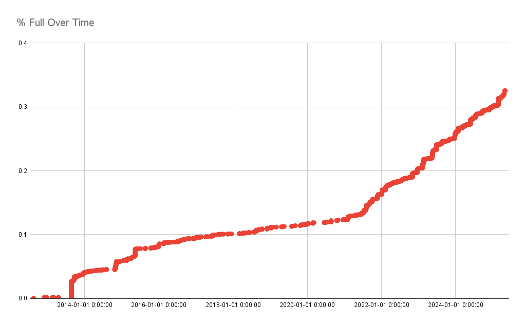
The idea is to track how quickly my media library is growing by looking at the file time stamps and the sizes of them and then plotting that in a graph.

I can easily do the first part but I don't exactly know how to make the graph.

I guess I could just make a spreadsheet. But I wonder if there's a better way.

8

Comments

You must log in or register to comment.

twovests wrote

What kind of graph? A node-edge graph data structure? A bar chart, etc?

3

hollyhoppet wrote

for any scripting language i'm sure there's a charting library or two out there if you want to be codey about it.

4

twovests wrote

If you like a scripty solution, Python's matplotlib is pretty good, but pandas (dataframe manipulation library) also has a quick dataframe.plot(...) method that I lile.

If I had a better idea of what your data would look like (pairs of date string x file size?) I could give you a quick 10-liner that would do it too

2

flabberghaster OP wrote

Yeah my first idea is literally just find all the file sizes and time stamps, sort by time stamp, then have a running total of the size. Then make a scatter plot with the X axis as the time and the Y axis as the total size.

2

flabberghaster OP wrote

This has a few errors in it (i called it % full when it's actually not scaled to 100, for starters) but it gives me an idea of what rate it's growing at so that's something.

Graph

Still I'd like it to look nicer.

2

victoria wrote (edited )

I did this with last.fm api data a few years ago (here) and it looks about the same tbh

It’s not great, but i coildny really think of a better way of visualizing it and it was just an afternoons worth of work, so i think im ok with it

3