flabberghaster OP wrote
Reply to comment by flabberghaster in I have a fun idea that I don't know how to execute. by flabberghaster
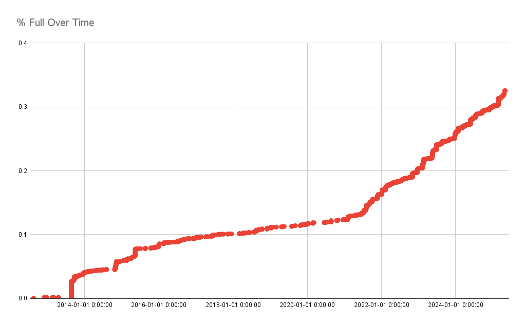
This has a few errors in it (i called it % full when it's actually not scaled to 100, for starters) but it gives me an idea of what rate it's growing at so that's something.

Still I'd like it to look nicer.
Viewing a single comment thread. View all comments